Plotting functions in PIASO#
This notebook will demonstrate the different plotting functions and their application to sample data.
[1]:
path = '/home/vas744/Analysis/Python/Packages/PIASO'
import sys
sys.path.append(path)
[2]:
import piaso
import scanpy as sc
import numpy as np
import matplotlib.pyplot as plt
import warnings
/home/vas744/.local/lib/python3.9/site-packages/networkx/utils/backends.py:135: RuntimeWarning: networkx backend defined more than once: nx-loopback
  backends.update(_get_backends("networkx.backends"))
[3]:
sc.set_figure_params(dpi=80,dpi_save=300, color_map='viridis',facecolor='white')
from matplotlib import rcParams
rcParams['figure.figsize'] = 4, 4
[4]:
warnings.simplefilter(action='ignore', category=FutureWarning)
Load the data#
Let us load a 20k subsampled version of the Seattle Alzheimer’s Disease Brain Cell Atlas (SEA-AD) project dataset described in detail in Gabitto et. al. (2024). We will be using the scRNA-seq data from the dataset in this tutorial.
Download the subsampled dataset from Google Drive: https://drive.google.com/file/d/1EdRA0ECvPlEnNaOzKqj19GrEtucB7hmE/view?usp=drive_link
The original data is available on https://portal.brain-map.org/explore/seattle-alzheimers-disease.
[5]:
!/home/vas744/Software/gdrive files download --overwrite --destination /n/scratch/users/v/vas744/Data/Public/PIASO 1EdRA0ECvPlEnNaOzKqj19GrEtucB7hmE
Downloading SEA-AD_RNA_MTG_subsample_excludeReference_20k_piaso.h5ad
Successfully downloaded SEA-AD_RNA_MTG_subsample_excludeReference_20k_piaso.h5ad
[6]:
adata=sc.read('/n/scratch/users/v/vas744/Data/Public/PIASO/SEA-AD_RNA_MTG_subsample_excludeReference_20k_piaso.h5ad')
[7]:
adata
[7]:
AnnData object with n_obs × n_vars = 20000 × 36601
    obs: 'sample_id', 'Neurotypical reference', 'Donor ID', 'Organism', 'Brain Region', 'Sex', 'Gender', 'Age at Death', 'Race (choice=White)', 'Race (choice=Black/ African American)', 'Race (choice=Asian)', 'Race (choice=American Indian/ Alaska Native)', 'Race (choice=Native Hawaiian or Pacific Islander)', 'Race (choice=Unknown or unreported)', 'Race (choice=Other)', 'specify other race', 'Hispanic/Latino', 'Highest level of education', 'Years of education', 'PMI', 'Fresh Brain Weight', 'Brain pH', 'Overall AD neuropathological Change', 'Thal', 'Braak', 'CERAD score', 'Overall CAA Score', 'Highest Lewy Body Disease', 'Total Microinfarcts (not observed grossly)', 'Total microinfarcts in screening sections', 'Atherosclerosis', 'Arteriolosclerosis', 'LATE', 'Cognitive Status', 'Last CASI Score', 'Interval from last CASI in months', 'Last MMSE Score', 'Interval from last MMSE in months', 'Last MOCA Score', 'Interval from last MOCA in months', 'APOE Genotype', 'Primary Study Name', 'Secondary Study Name', 'NeuN positive fraction on FANS', 'RIN', 'cell_prep_type', 'facs_population_plan', 'rna_amplification', 'sample_name', 'sample_quantity_count', 'expc_cell_capture', 'method', 'pcr_cycles', 'percent_cdna_longer_than_400bp', 'rna_amplification_pass_fail', 'amplified_quantity_ng', 'load_name', 'library_prep', 'library_input_ng', 'r1_index', 'avg_size_bp', 'quantification_fmol', 'library_prep_pass_fail', 'exp_component_vendor_name', 'batch_vendor_name', 'experiment_component_failed', 'alignment', 'Genome', 'ar_id', 'bc', 'GEX_Estimated_number_of_cells', 'GEX_number_of_reads', 'GEX_sequencing_saturation', 'GEX_Mean_raw_reads_per_cell', 'GEX_Q30_bases_in_barcode', 'GEX_Q30_bases_in_read_2', 'GEX_Q30_bases_in_UMI', 'GEX_Percent_duplicates', 'GEX_Q30_bases_in_sample_index_i1', 'GEX_Q30_bases_in_sample_index_i2', 'GEX_Reads_with_TSO', 'GEX_Sequenced_read_pairs', 'GEX_Valid_UMIs', 'GEX_Valid_barcodes', 'GEX_Reads_mapped_to_genome', 'GEX_Reads_mapped_confidently_to_genome', 'GEX_Reads_mapped_confidently_to_intergenic_regions', 'GEX_Reads_mapped_confidently_to_intronic_regions', 'GEX_Reads_mapped_confidently_to_exonic_regions', 'GEX_Reads_mapped_confidently_to_transcriptome', 'GEX_Reads_mapped_antisense_to_gene', 'GEX_Fraction_of_transcriptomic_reads_in_cells', 'GEX_Total_genes_detected', 'GEX_Median_UMI_counts_per_cell', 'GEX_Median_genes_per_cell', 'Multiome_Feature_linkages_detected', 'Multiome_Linked_genes', 'Multiome_Linked_peaks', 'ATAC_Confidently_mapped_read_pairs', 'ATAC_Fraction_of_genome_in_peaks', 'ATAC_Fraction_of_high_quality_fragments_in_cells', 'ATAC_Fraction_of_high_quality_fragments_overlapping_TSS', 'ATAC_Fraction_of_high_quality_fragments_overlapping_peaks', 'ATAC_Fraction_of_transposition_events_in_peaks_in_cells', 'ATAC_Mean_raw_read_pairs_per_cell', 'ATAC_Median_high_quality_fragments_per_cell', 'ATAC_Non-nuclear_read_pairs', 'ATAC_Number_of_peaks', 'ATAC_Percent_duplicates', 'ATAC_Q30_bases_in_barcode', 'ATAC_Q30_bases_in_read_1', 'ATAC_Q30_bases_in_read_2', 'ATAC_Q30_bases_in_sample_index_i1', 'ATAC_Sequenced_read_pairs', 'ATAC_TSS_enrichment_score', 'ATAC_Unmapped_read_pairs', 'ATAC_Valid_barcodes', 'Number of mapped reads', 'Number of unmapped reads', 'Number of multimapped reads', 'Number of reads', 'Number of UMIs', 'Genes detected', 'Doublet score', 'Fraction mitochondrial UMIs', 'Used in analysis', 'Class confidence', 'Class', 'Subclass confidence', 'Subclass', 'Supertype confidence', 'Supertype (non-expanded)', 'Supertype', 'Continuous Pseudo-progression Score', 'Severely Affected Donor'
    var: 'gene_ids'
    uns: 'APOE4 Status_colors', 'Braak_colors', 'CERAD score_colors', 'Cognitive Status_colors', 'Great Apes Metadata', 'Highest Lewy Body Disease_colors', 'LATE_colors', 'Overall AD neuropathological Change_colors', 'Sex_colors', 'Subclass_colors', 'Supertype_colors', 'Thal_colors', 'UW Clinical Metadata', 'X_normalization', 'batch_condition', 'default_embedding', 'neighbors', 'title', 'umap'
    obsm: 'X_scVI', 'X_umap'
    layers: 'UMIs'
    obsp: 'connectivities', 'distances'
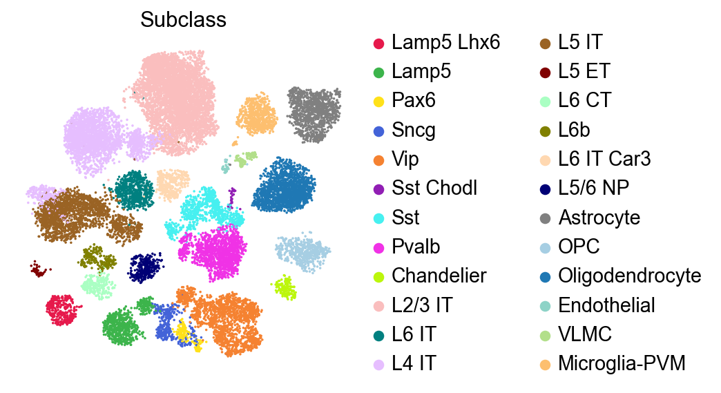
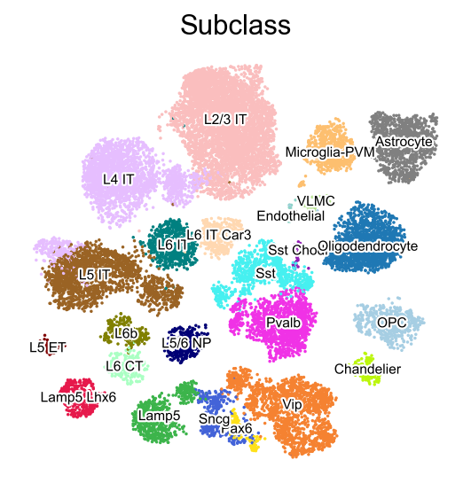
Visualize with a discrete color map#
The discrete color map can be used to visualize the categorical variables such as cell subclass.
[8]:
sc.pl.embedding(adata,
                basis='X_umap',
                color=['Subclass'],
                palette=piaso.pl.color.d_color3,
                legend_fontoutline=2,
                legend_fontweight=5,
                cmap='Spectral_r',
                size=10,
                frameon=False)
[9]:
sc.pl.embedding(adata,
                basis='X_umap',
                color=['Subclass'],
                palette=piaso.pl.color.d_color3,
                legend_fontoutline=2,
                legend_fontsize=7,
                legend_fontweight=5,
                legend_loc='on data',
                cmap='Spectral_r',
                size=10,
                frameon=False)
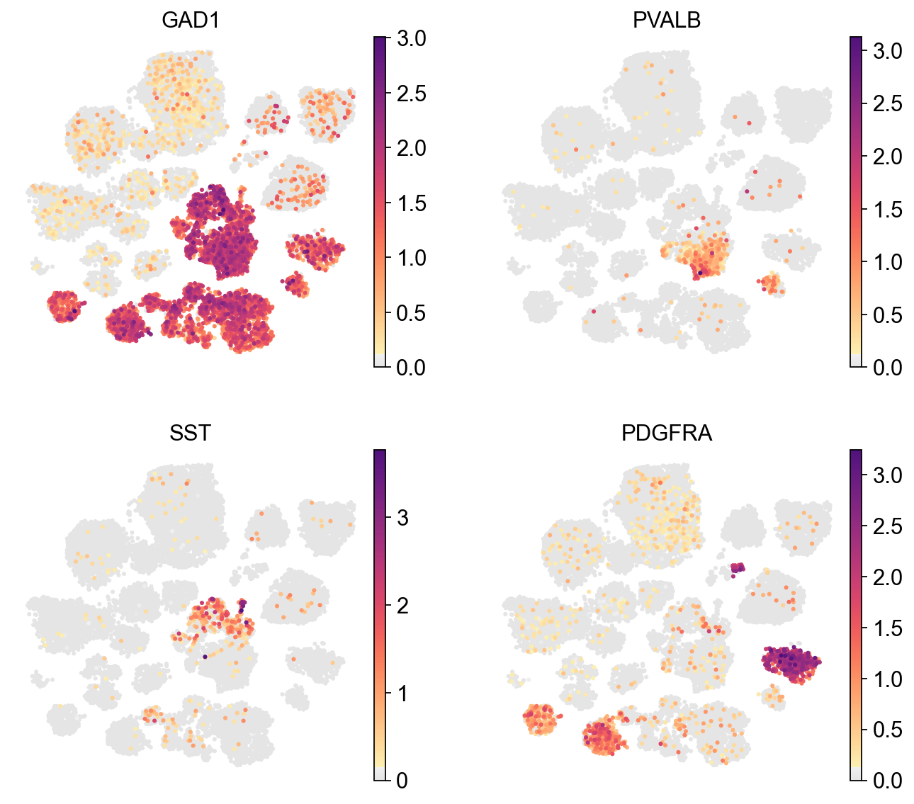
Visualize with a continuous color map#
The continuous color map can be used to visualize the continuous variables such as gene expression.
[10]:
sc.pl.umap(adata,
           color=['GAD1', 'PVALB', 'SST', 'PDGFRA'],
           cmap=piaso.pl.color.c_color1,
           legend_fontsize=10,
           legend_fontoutline=3,
           ncols=2,
           size=30,
           frameon=False)
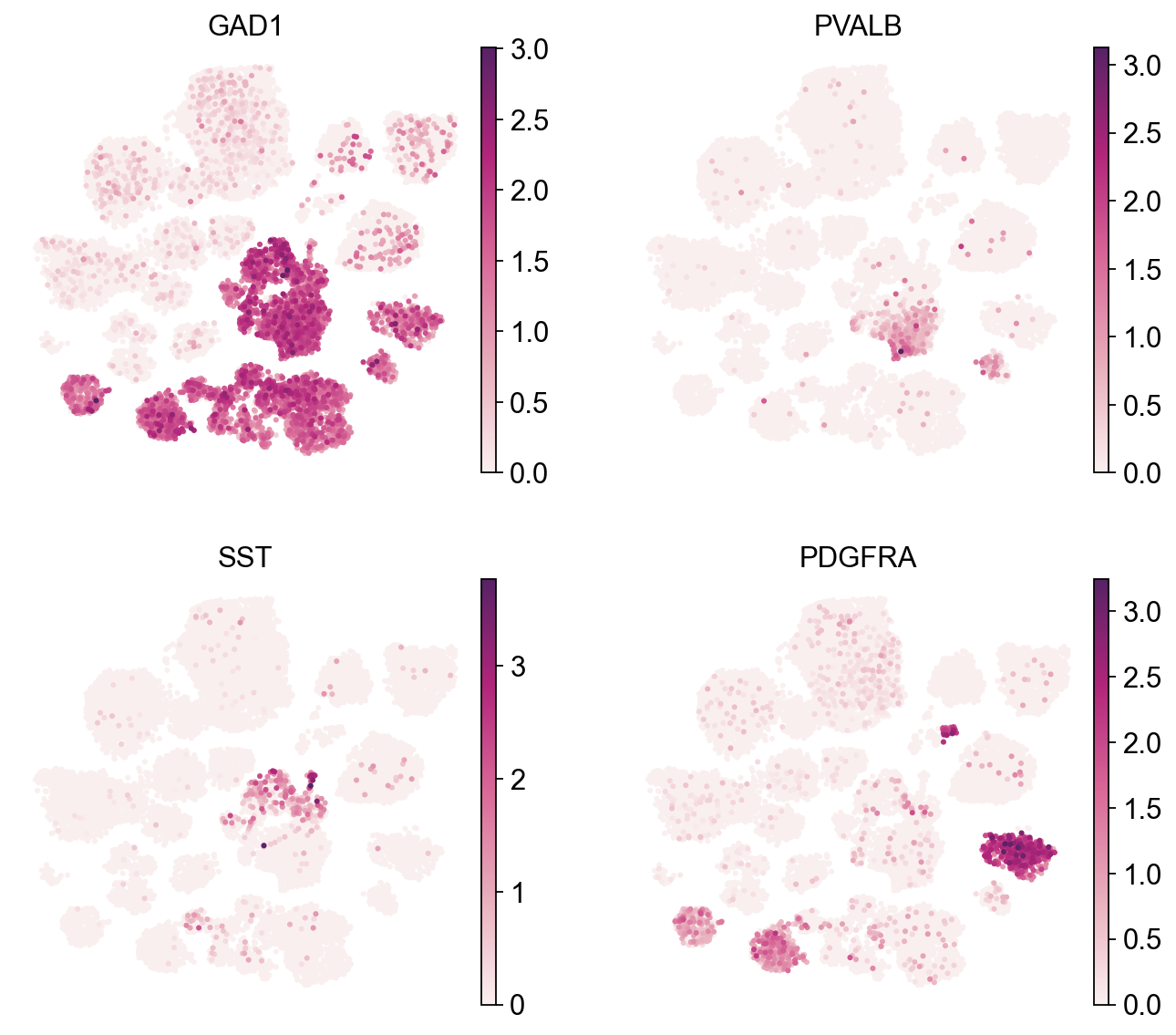
[11]:
sc.pl.umap(adata,
           color=['GAD1', 'PVALB', 'SST', 'PDGFRA'],
           cmap=piaso.pl.color.c_color4,
           legend_fontsize=10,
           legend_fontoutline=3,
           ncols=2,
           size=30,
           frameon=False)
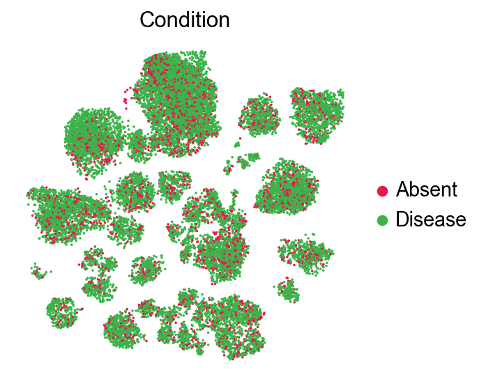
Split the UMAP by condition#
[12]:
mapping_dict=dict(zip(adata.obs['CERAD score'], adata.obs['CERAD score']))
[13]:
mapping_dict={'Absent': 'Absent',
 'Sparse': 'Disease',
 'Moderate': 'Disease',
 'Frequent': 'Disease'}
[14]:
adata.obs['Condition']=adata.obs['CERAD score'].map(mapping_dict)
[15]:
sc.pl.embedding(adata,
                basis='X_umap',
                color=['Condition'],
                palette=piaso.pl.color.d_color1,
                legend_fontoutline=2,
                legend_fontweight=5,
                cmap='Spectral_r',
                size=10,
                frameon=False)
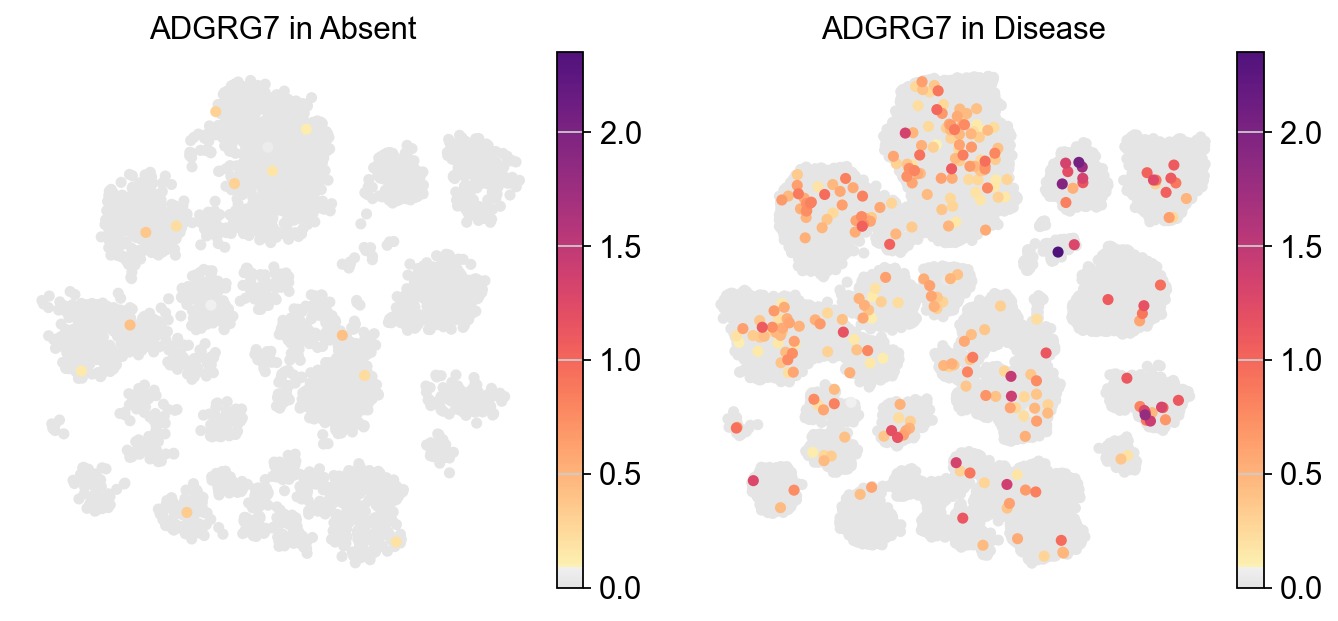
Visualizing the expression of a specific gene across two different experimental conditions#
[16]:
piaso.pl.plot_embeddings_split(adata,
                               color='ADGRG7',
                               layer=None,
                               splitby='Condition',
                               color_map=piaso.pl.color.c_color1,
                               size=100,
                               frameon=False,
                               legend_loc=None,)
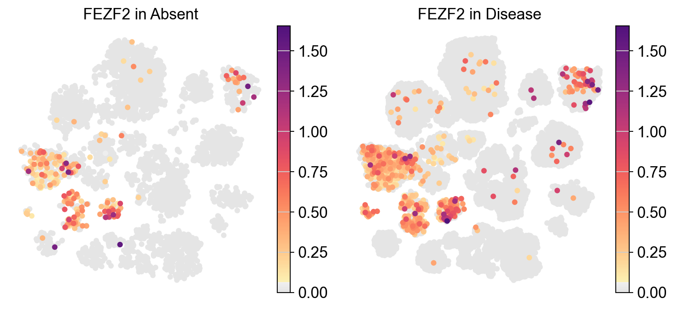
[17]:
piaso.pl.plot_embeddings_split(adata,
                               color='FEZF2',
                               layer=None,
                               splitby='Condition',
                               color_map=piaso.pl.color.c_color1,
                               size=100,
                               frameon=False,
                               legend_loc=None,)
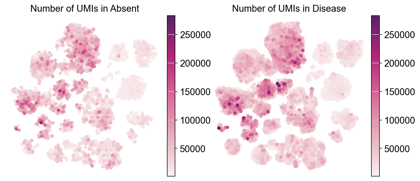
Visulaizing continuous variables (Number of UMIs) across different experimental conditions#
[18]:
piaso.pl.plot_embeddings_split(adata,
                               color='Number of UMIs',
                               layer=None,
                               splitby='Condition',
                               color_map=piaso.pl.color.c_color4,
                               size=100,
                               frameon=False,
                               legend_loc=None)
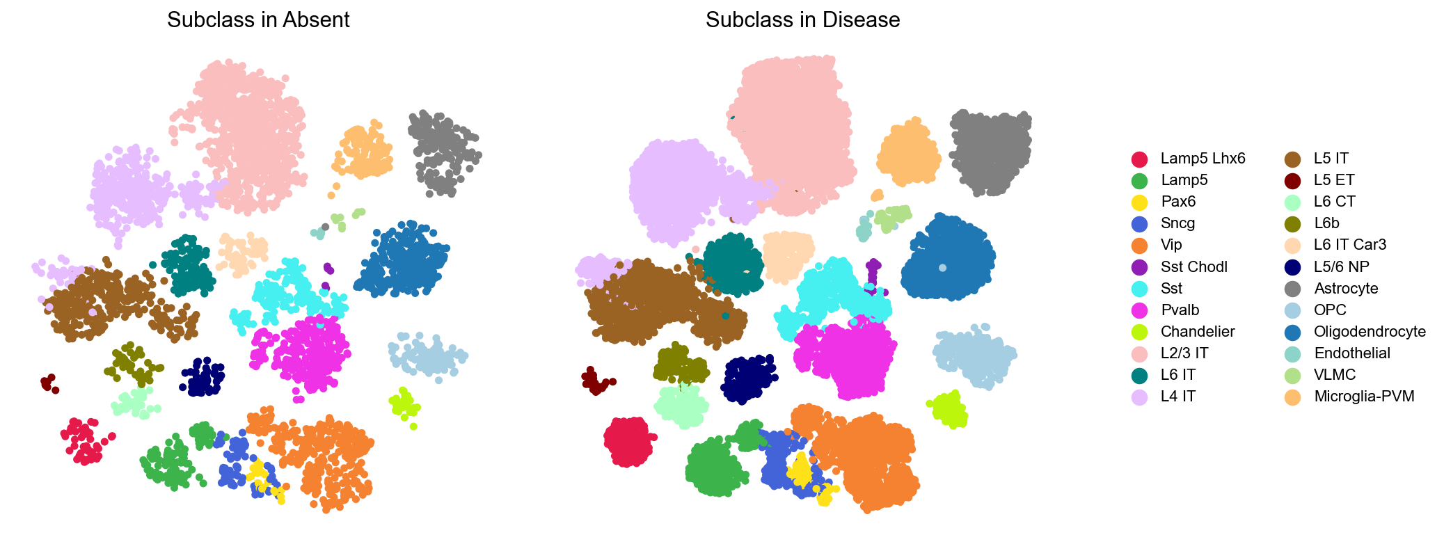
Visualizing categorical variables (Cell subclass) across different experimental conditions#
[19]:
piaso.pl.plot_embeddings_split(adata,
                               color='Subclass',
                               layer=None,
                               splitby='Condition',
                               size=100,
                               frameon=False,)
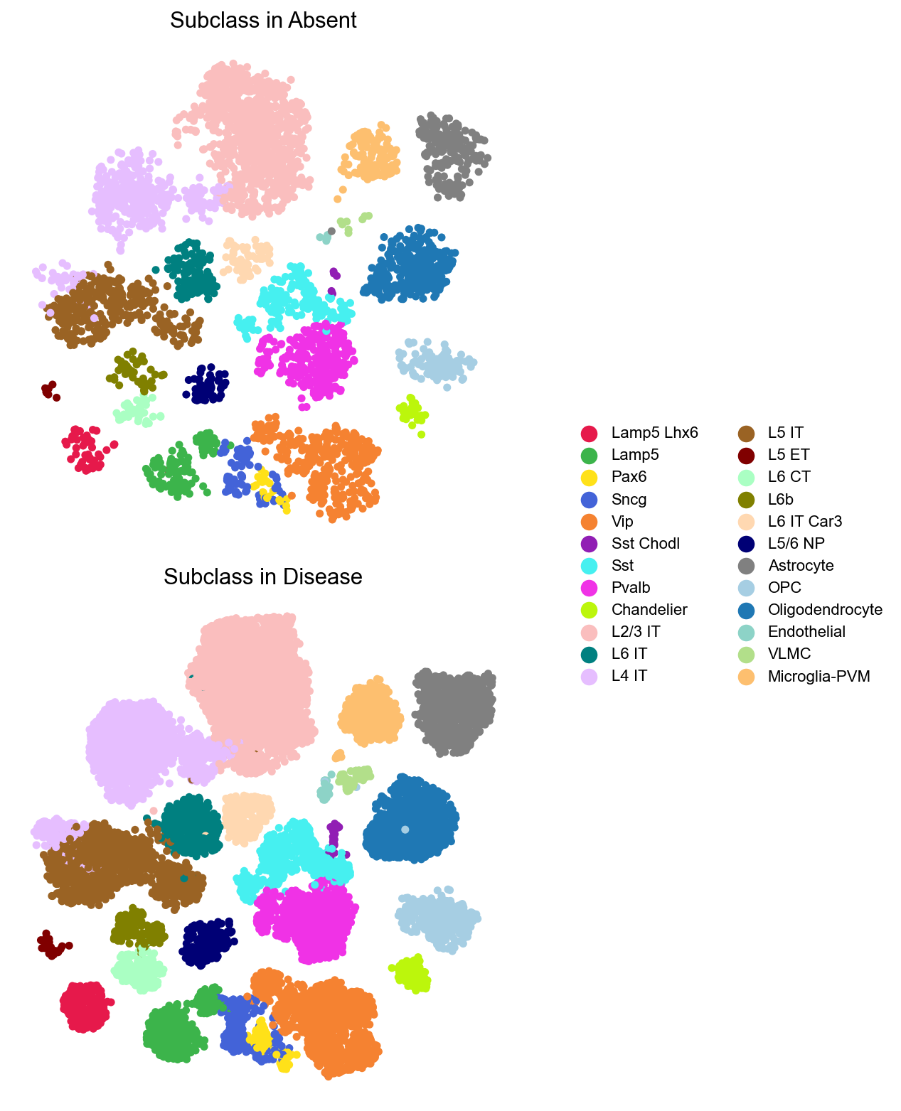
We can visualize these cell subclasses alongside the subclass legend. To enhance clarity, the ncol parameter can be used to adjust the number of subplots per row.
[20]:
piaso.pl.plot_embeddings_split(adata,
                               color='Subclass',
                               layer=None,
                               splitby='Condition',
                               size=100,
                               frameon=False,
                               ncol=1)
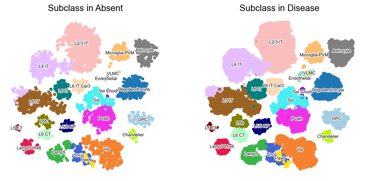
[21]:
piaso.pl.plot_embeddings_split(adata,
                               color='Subclass',
                               layer=None,
                               splitby='Condition',
                               size=100,
                               frameon=False,
                               legend_fontsize=7,
                               legend_fontoutline=2,
                               legend_fontweight=5,
                               legend_loc='on data')
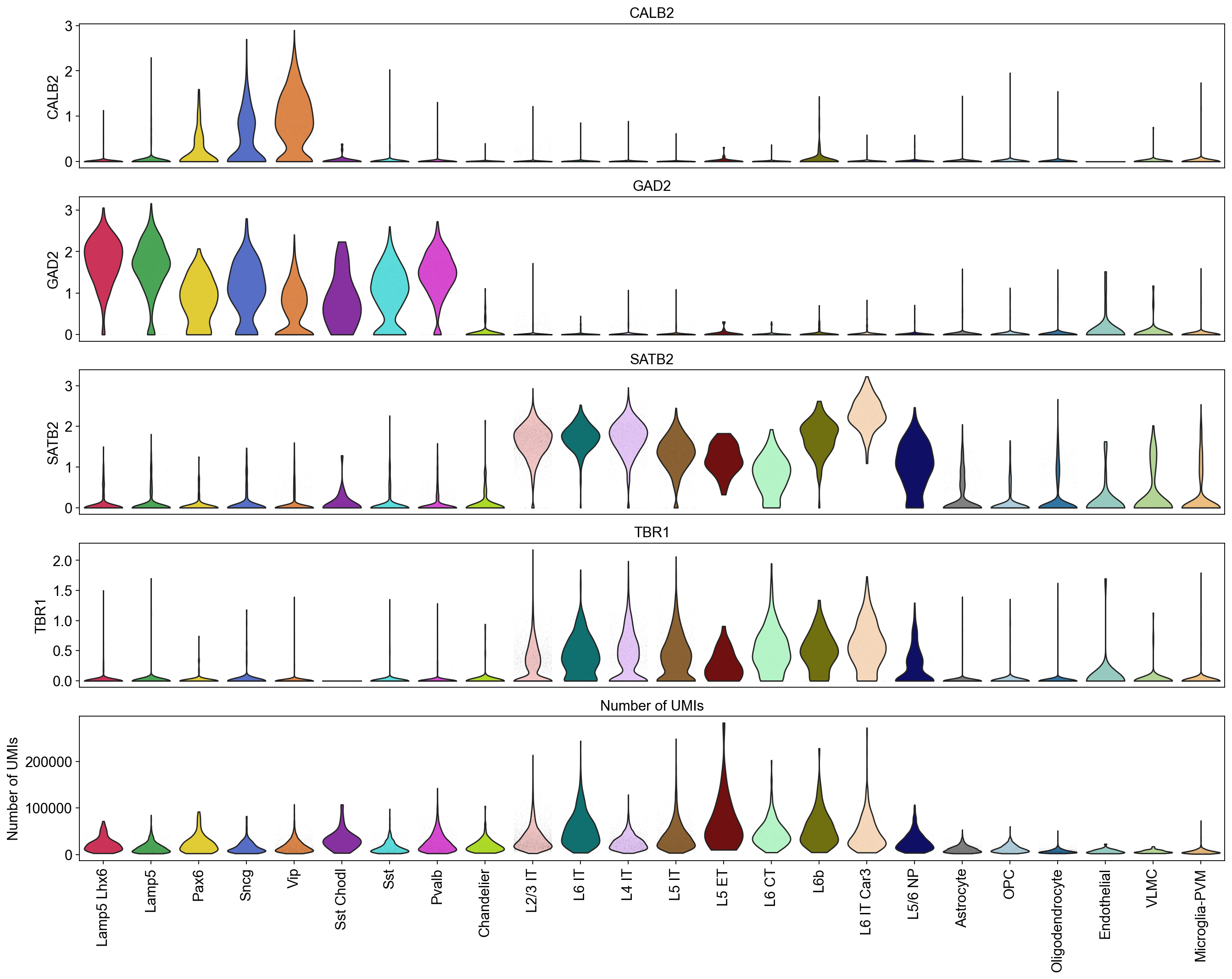
Violin plots of grouped data#
Visulaize how the groups in the dataset vary across a list of different features. Here, you can plot a different subplot for each feature of interest.
[22]:
piaso.pl.plot_features_violin(adata,
                              feature_list=[ 'CALB2', 'GAD2', 'SATB2', 'TBR1', 'Number of UMIs'],
                              width_single=8,
                              height_single=2.3,
                              groupby='Subclass',
                              show_grid=False)
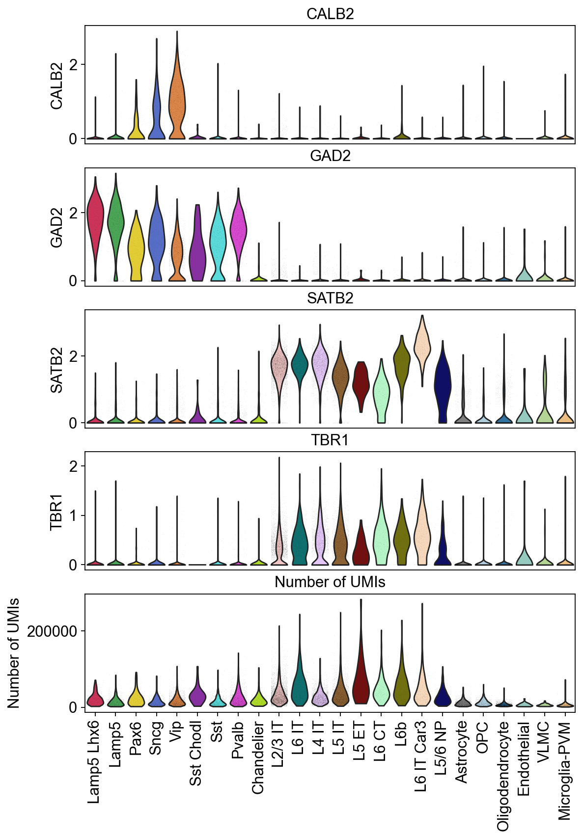
Adding the horizontal grid line
[23]:
piaso.pl.plot_features_violin(adata,
                              feature_list=[ 'CALB2', 'GAD2', 'SATB2', 'TBR1', 'Number of UMIs'],
                              width_single=8,
                              height_single=2.3,
                              groupby='Subclass')

The height and widhts of these plots can be adjusted according to the number of features and groups you have for better visualization.
[24]:
piaso.pl.plot_features_violin(adata,
                              feature_list=[ 'CALB2', 'GAD2', 'SATB2', 'TBR1', 'Number of UMIs'],
                              width_single=20,
                              height_single=3,
                              groupby='Subclass',
                              show_grid=False)
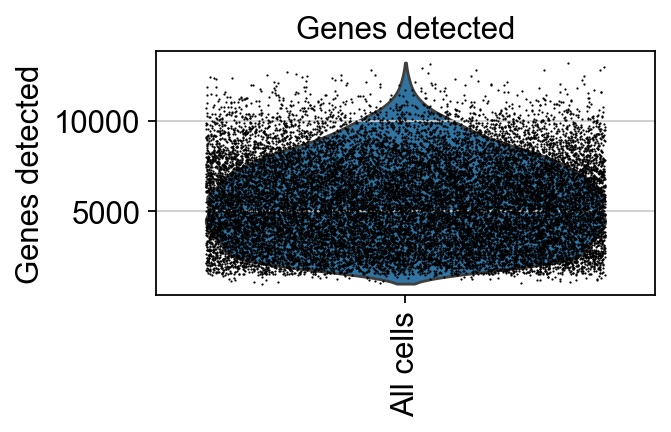
Violin plots of entire data#
We can visualize the entire dataset as a single group, adjusting the dot size to plot all the cells onto the violin plot.
[25]:
piaso.pl.plot_features_violin(adata,
                              feature_list=[ 'Genes detected'],
                              width_single=4,
                              height_single=2.0,
                              size=1)
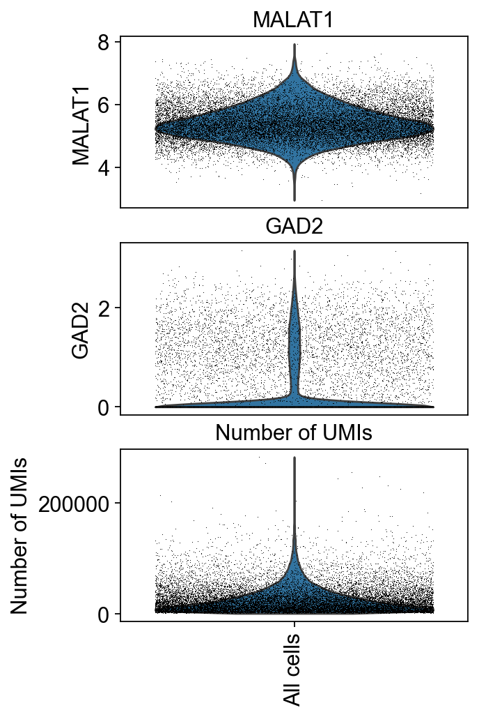
We can visualize the distributions of the cells across various features together.
[26]:
piaso.pl.plot_features_violin(adata,
                              feature_list=[ 'MALAT1', 'GAD2', 'Number of UMIs'],
                              width_single=4,
                              height_single=2.3,
                              size=0.5,
                              show_grid=False)
Save output plots#
Use the save parameter to specific the file name and path to save:
[27]:
piaso.pl.plot_embeddings_split(adata,
                               color='ADGRG7',
                               layer=None,
                               splitby='Condition',
                               color_map=piaso.pl.color.c_color1,
                               size=100,
                               frameon=False,
                               legend_loc=None,
                               save='./PIASO_UMAP_split_by_condition.pdf')

Figure saved to: ./PIASO_UMAP_split_by_condition.pdf
[28]:
piaso.pl.plot_features_violin(adata,
                              feature_list=[ 'CALB2', 'GAD2', 'SATB2', 'TBR1', 'Number of UMIs'],
                              width_single=8,
                              height_single=2.3,
                              groupby='Subclass',
                              show_grid=False,
                              save='./violin_plot_piaso.pdf')
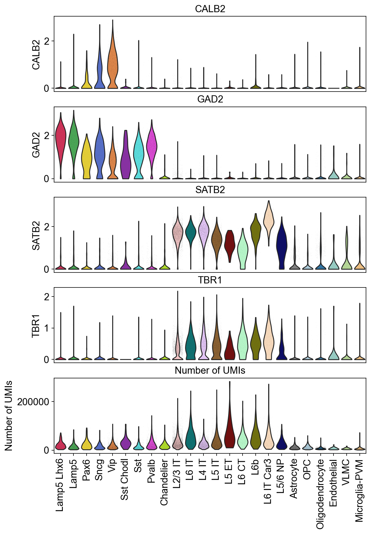
Figure saved to: ./violin_plot_piaso.pdf
Combine categorical variables#
[29]:
mapping_dict={'Absent': 'Control',
 'Sparse': 'Disease',
 'Moderate': 'Disease',
 'Frequent': 'Disease'}
[30]:
adata.obs['Condition']=adata.obs['CERAD score'].map(mapping_dict)
[31]:
adata.obs['SubclassXCondition'] = piaso.pp.getCrossCategories(adata.obs, 'Subclass', 'Condition', )
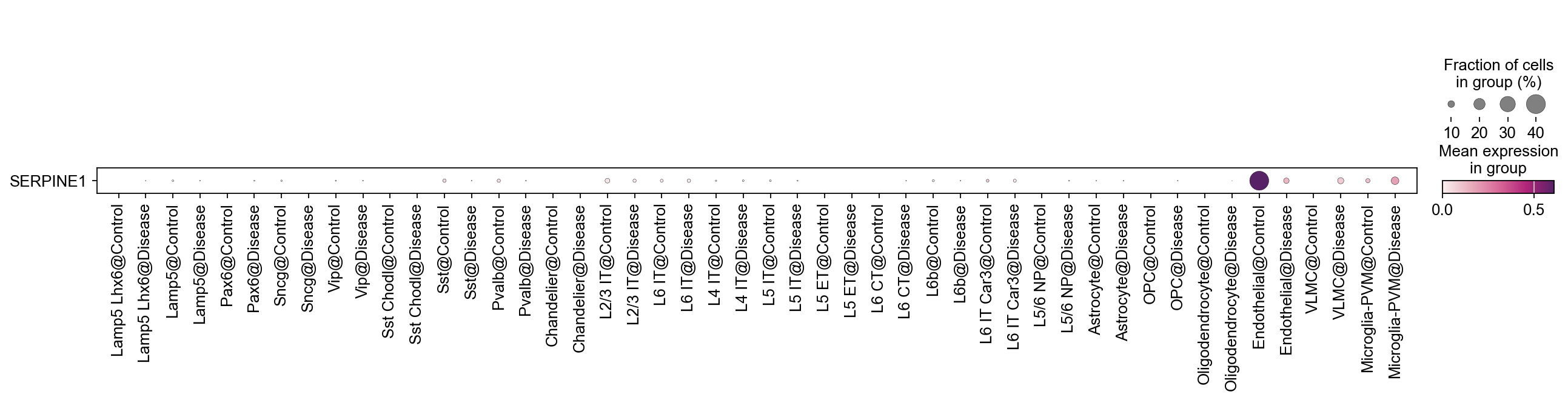
By combining multiple categories, while maintaining the original orders of the categories, you could show the gene expression changes at cell type level across different conditions.
[32]:
sc.pl.dotplot(
    adata,
    var_names=['SERPINE1'],
    groupby='SubclassXCondition',
    swap_axes=True,
    cmap=piaso.pl.color.c_color4
)
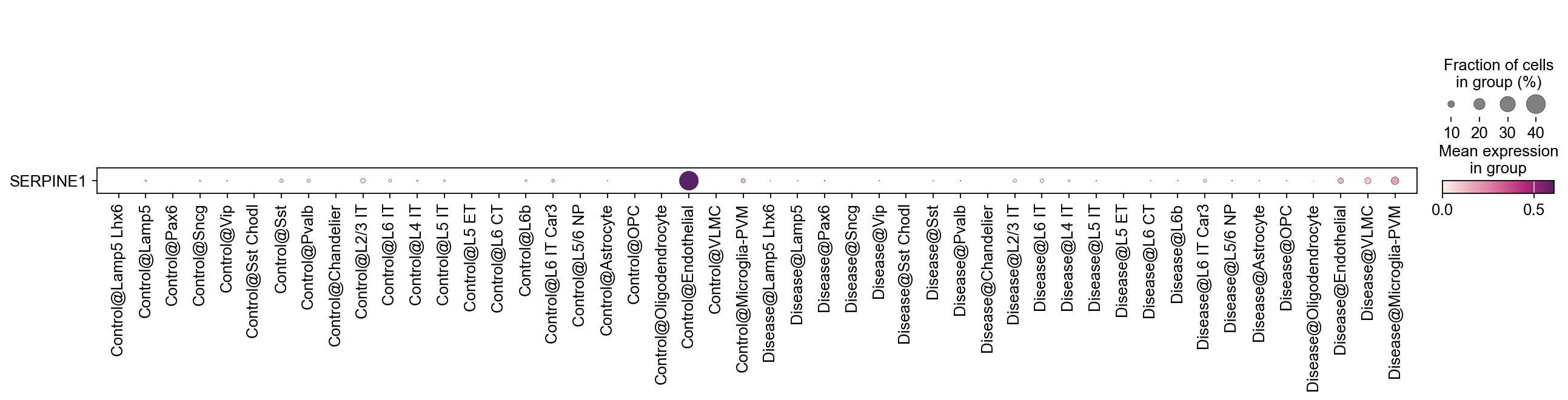
We can also switch the order in which we combine the categorical variables.
[33]:
adata.obs['ConditionXSubclass'] = piaso.pp.getCrossCategories(adata.obs, 'Condition', 'Subclass',)
[34]:
sc.pl.dotplot(
    adata,
    var_names=['SERPINE1'],
    groupby='ConditionXSubclass',
    swap_axes=True,
    cmap=piaso.pl.color.c_color4
)
Count the number of cells in each category#
[35]:
piaso.pp.table(adata.obs['Subclass'])
[35]:
{'Microglia-PVM': 638,
 'Lamp5': 653,
 'OPC': 496,
 'L5/6 NP': 299,
 'Oligodendrocyte': 1663,
 'L2/3 IT': 4826,
 'Vip': 1551,
 'Lamp5 Lhx6': 305,
 'L5 IT': 1797,
 'L4 IT': 2388,
 'Pvalb': 1299,
 'Astrocyte': 1080,
 'L6 IT': 605,
 'Sst': 780,
 'L6 IT Car3': 354,
 'VLMC': 86,
 'L6b': 224,
 'Pax6': 140,
 'L6 CT': 231,
 'Sncg': 329,
 'L5 ET': 37,
 'Chandelier': 157,
 'Sst Chodl': 31,
 'Endothelial': 31}
You can use the rank parameter to order the results, and the ascending parameter to determine the order of the ranking.
[36]:
piaso.pp.table(adata.obs['Subclass'], rank = True, ascending = True)
[36]:
{'Sst Chodl': 31,
 'Endothelial': 31,
 'L5 ET': 37,
 'VLMC': 86,
 'Pax6': 140,
 'Chandelier': 157,
 'L6b': 224,
 'L6 CT': 231,
 'L5/6 NP': 299,
 'Lamp5 Lhx6': 305,
 'Sncg': 329,
 'L6 IT Car3': 354,
 'OPC': 496,
 'L6 IT': 605,
 'Microglia-PVM': 638,
 'Lamp5': 653,
 'Sst': 780,
 'Astrocyte': 1080,
 'Pvalb': 1299,
 'Vip': 1551,
 'Oligodendrocyte': 1663,
 'L5 IT': 1797,
 'L4 IT': 2388,
 'L2/3 IT': 4826}
[37]:
piaso.pp.table(adata.obs['Subclass'], rank = True, ascending = False)
[37]:
{'L2/3 IT': 4826,
 'L4 IT': 2388,
 'L5 IT': 1797,
 'Oligodendrocyte': 1663,
 'Vip': 1551,
 'Pvalb': 1299,
 'Astrocyte': 1080,
 'Sst': 780,
 'Lamp5': 653,
 'Microglia-PVM': 638,
 'L6 IT': 605,
 'OPC': 496,
 'L6 IT Car3': 354,
 'Sncg': 329,
 'Lamp5 Lhx6': 305,
 'L5/6 NP': 299,
 'L6 CT': 231,
 'L6b': 224,
 'Chandelier': 157,
 'Pax6': 140,
 'VLMC': 86,
 'L5 ET': 37,
 'Sst Chodl': 31,
 'Endothelial': 31}
In order to store the results as a dataframe, set as_dataframe = True.
[38]:
subclass_df = piaso.pp.table(adata.obs['Subclass'], rank = True, ascending = False, as_dataframe = True)